Here they are!
Let me know what you think! I’d be very curious to hear!
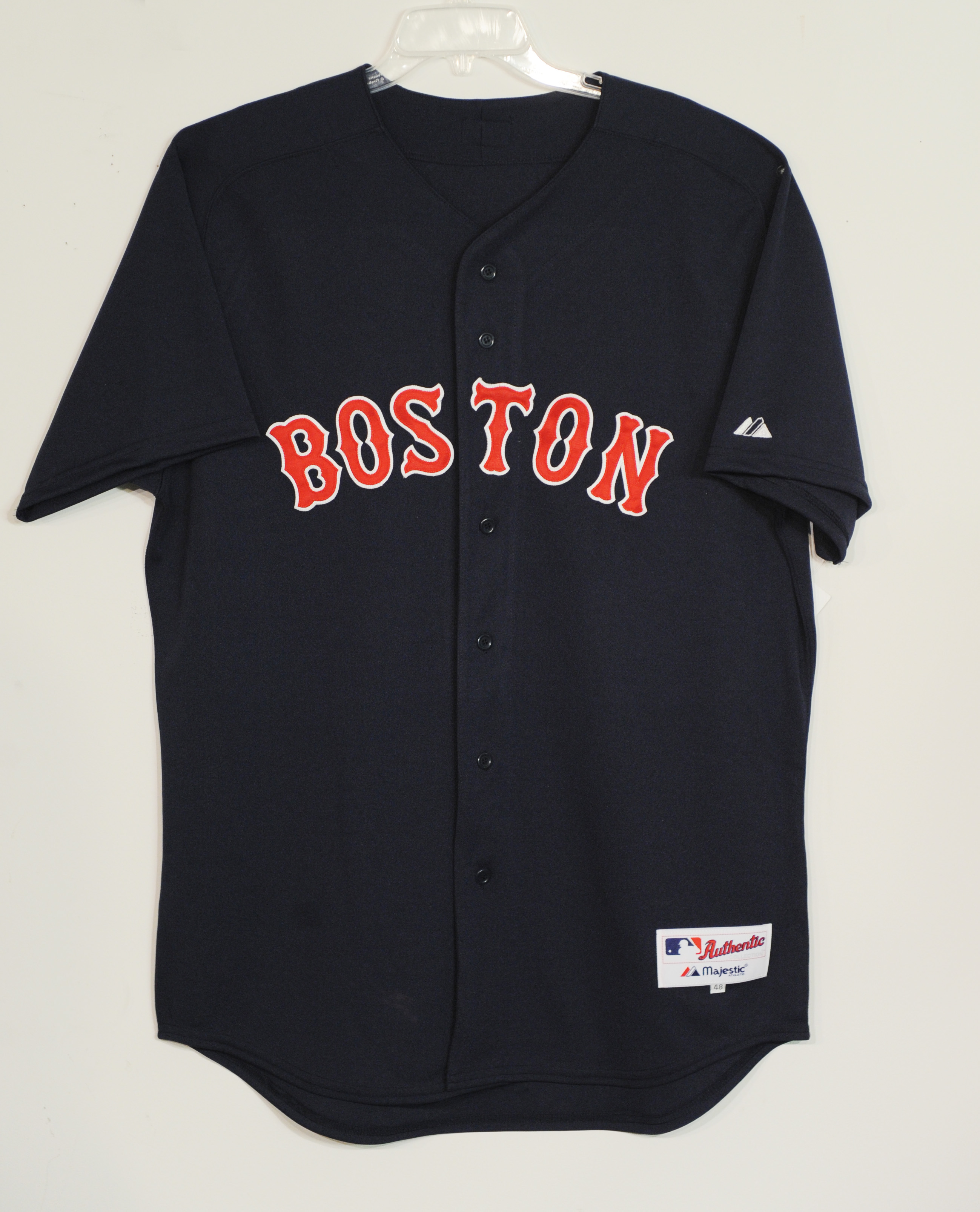
Here’s the new “primary road jersey.” This is the one you will most often see the team wear on the road. It has a little flair for the 1980’s jerseys (for those of you that remember them). Though it is different in a couple of different ways. The font on the front is in “Red Sox Font” as opposed to the ones from the 80’s where it was a little more of a “block” font. This new one also has the “hanging sox” logo on the sleeve (the one closest to the heart – how poetic!)

Mike Ivins/Boston Red Sox
Now, here is the “alternate road jersey.” This one has a similar feel to the Batting Practice jersey’s you sometimes see the team wear. In my opinion, it’s good. It’s classic. No harm done. Joseph Abboud said it was his favorite of the jerseys. So take that!
Mike Ivins/Boston Red Sox
Now, here is a familiar one, with a slight change…This is the “Alternate home jersey.” To most, this will look exactly the same as the red jerseys we’ve worn in recent years. The only real change is that the navy blue “piping” that went down the middle of the jersey and edge of the sleeve, has been removed.
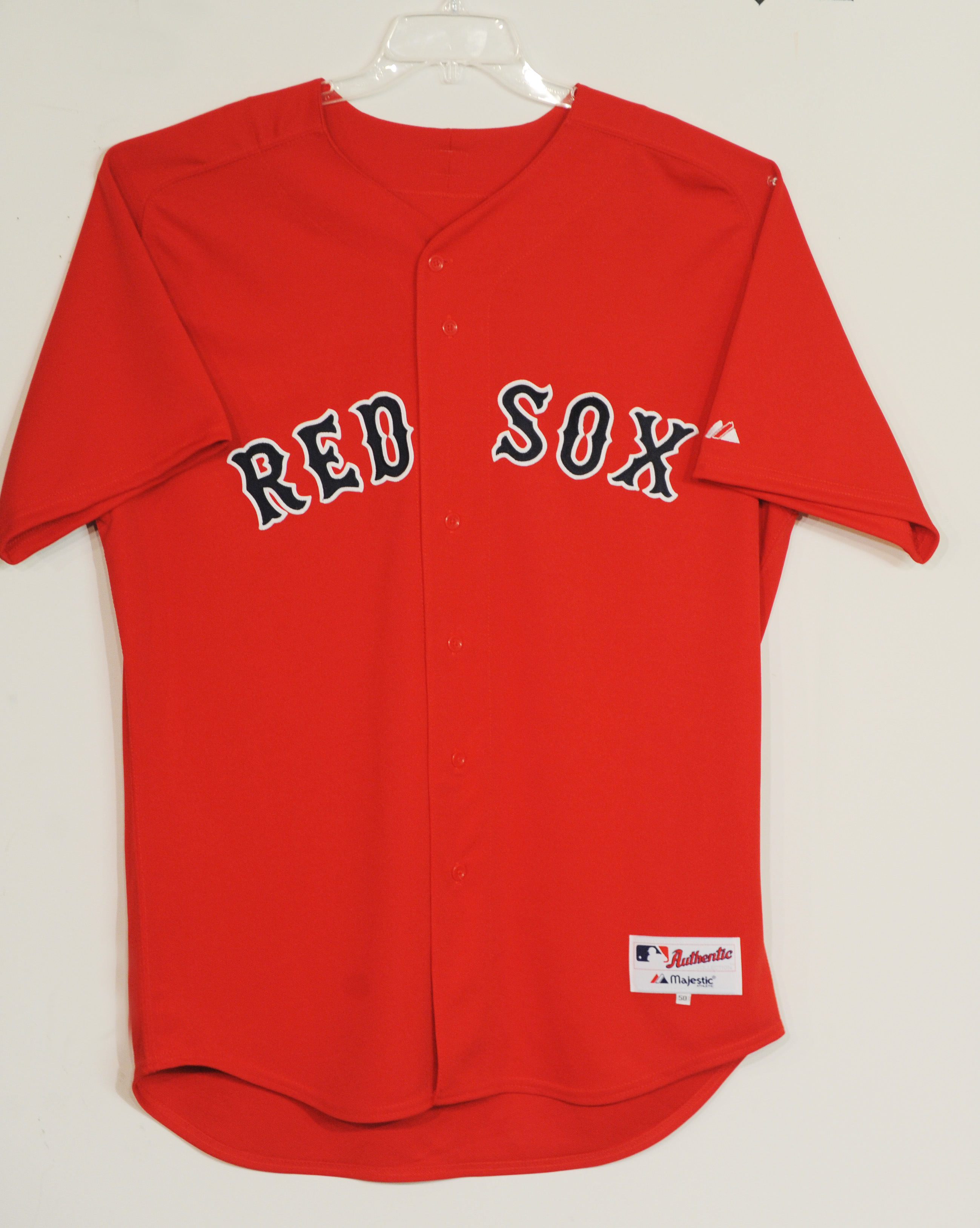
Mike Ivins/Boston Red Sox
And lastly, we have a new “alternate cap.” This cap will be worn only with the alternate blue and alternate red jerseys.
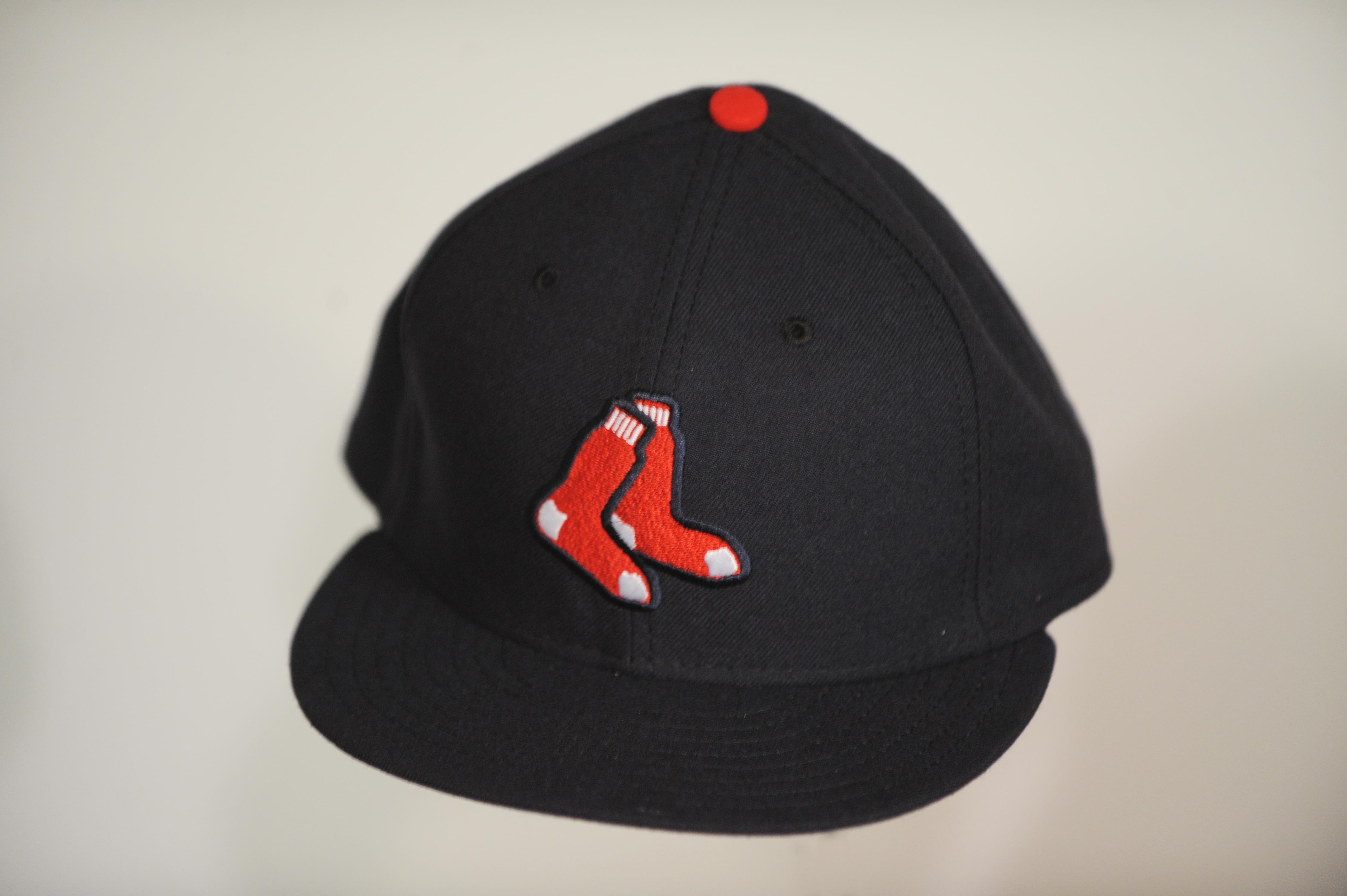
Mike Ivins/Boston Red Sox
And a nice artsy one courtesy of the Big I…
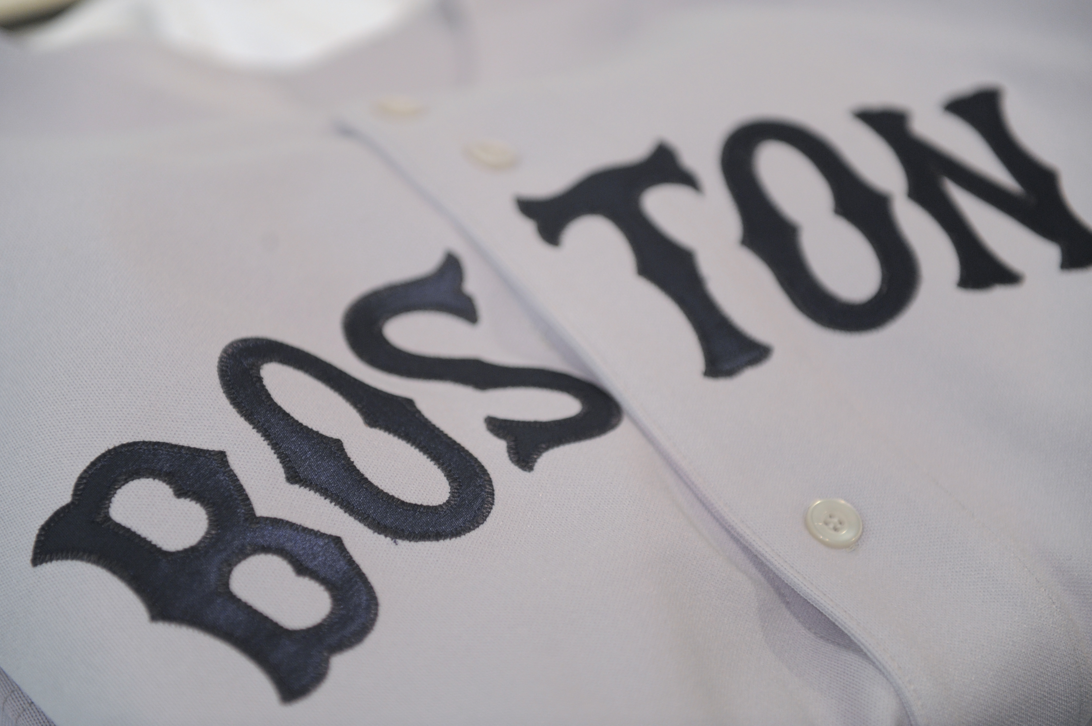
Mike Ivins/Boston Red Sox
Oh, and don’t worry, no changes to the classic white home primary jersey.
Tell me, tell me. Do you like them? Which is your favorite? What would you do if you could design them? Of course, you can always email me and let me know: insider@redsox.com
All the best from a very fashionable Front Office!
“The Voice of the Nation”
PS – Today, all around Boston, members of the Front Office will be sporting the new duds. If you see one of them, and compliment them on it, they’ll give you their new shirt, right off their back! Keep them eyes peeled!!

Love the new hat! I’m going to have to get me one!
Ian
distinctphoto.com
I wrote yesterday fearing for the wost, and now I am…relieved for the most part. The damage could have been much worse! Sorry, I guess I am a uniform geek, especially about “my” team.
First the bad:
1. Another alternate jersey? I have never liked alternate jerseys, but maybe I am in the minority. I guess if they allow fiddling with the uniform, for those who can’t leave well enough alone, while preserving the traditional jersey, they are worth having. I just hope the team wears them as little as possible.
2. While I don’t mind the “hanging sox” logo, I just don’t think it works as a cap logo. To see a Red Sox player with anything but the classic “B” on his cap will not look right at all. Now the good: I give major points to the front office for going back to the navy blue lettering for the away uniform. Wow does it look old. But good. Not quite as plain as the old jersey it’s based on (thanks to the font). And I think I like the hanging sox sleeve patch, although it kind of sticks out like a beacon without any other red on the shirt. However, the uniform is tastefully uncluttered and traditional and for this I am thankful. Lastly, THANK YOU Red Sox ownership for not changing the home whites or the primary cap!!!!
I agree with seisele – I have a little trouble with the “hanging sox” on the hat – it just looks a little off. Overall I like the changes! I remember the 1980s and like that it’s a tip to the past. I really like how it’s “Boston” that stands out. Nothing to clutter it up. Job well done!
Julia
http://werbiefitz.mlblogs.com/
The road would look much better if 1) it had red piping down the front and sleeves and 2) there was a red outline around the navy letters. I just doesn’t look right. The socks logo, however, looks fine on the sleeve.
The old-school gray road uniform with the blue lettering is outstanding. And here’s to the hanging socks.
I like it. I like it all, especially blue alternate road jerseys.
Just awful all around. The alternate jerseys look like softball unis and the hanging sox logo cap looks like something that should be worn in the Florida State League. I hated the road unis worn in the 80’s and these new retro style unis are just as hideous. I hope John Henry and the rest of the Sox front office come to ther senses and these never see the light of day. Poor Manny Delcarmen looked as though he was dressed to play for a neighborhood softball team.
The grey ones freak me out. They are way too much like Yankees uniforms!! Yuck!
The blue jerseys are OK. I will probably buy one.
I just bought a Road jersey the day before you announced the new jerseys, so I am glad that they will still be wearing them.
OK. I went to the Yard Sale & got some magazines,bricks,cards & bought some tickets. (Best ticket of my life!!!!!! I still cannot believe it.
Tell Theo to hurry up and sign Jason Varitek, the natives are really getting restless!!!!! Not Kidding. GO JASON !